Seeing Through Red, White and Blue Glasses
When Hillary Clinton unveiled her 2015 campaign logo, the armchair quarterbacking was intense. The right-pointing arrow signals conservative — especially when it’s red! That’s a Republican color!

The one thing nobody thought to mention, though: Clinton’s logo was blue, red, and white.
And why would they? The Republican frontrunners, like Jeb Bush and Scott Walker, use some combination of those colors too in their visual identities, too — and for that matter, so does every single one of the other dozen-plus presidential candidates this cycle.
“Obviously!” you say. “Those are the colors of the American flag. Duh!” But does that make it a smart political branding play? Is being the same worth it? Is patriotism the only thing a candidate should express through color? What emotions do colors stir, and how could campaigns use them more effectively?
Let’s find out.
First: What’s the Point of a Brand?
Let’s start with branding overall. What’s the point? Every business book in every airport bookstore in America could give you a different answer, but it all boils down to one thing: differentiation. Separating your offering from someone else’s.
Obviously choosing the same color scheme isn’t doing much to differentiate these candidates from each other. But when planning out a brand, it can actually be just as important to ground your efforts in points of parity — places where your brand has something in common with its competitors.
 Burning yourself with this elephant branding iron will really differentiate you alright. Go ahead and give it a whirl.
Take the tech services market. You’ve probably seen a lot of brands in that space that pick a name ending in “ly.” Bit.ly, Optimizely, Attentive.ly, and on and on. Every time you see that, I bet you recognize the brand as a tech services brand.
That’s about signaling category membership, and making your brand’s category instantly recognizable can be immensely beneficial. Think about it: You could come up with the most emotionally savvy color scheme in campaign design history, but if everyone who glanced at it thought you were selling tech services (or pickup trucks or shampoo or anything else), would that really be a good use of color?
Back to Politics
For a politician relying on those iconic three colors, then, the point may be less to differentiate one candidate from her fellows — and more about differentiating a given candidate from the broader world of brands.
Let’s face it, political campaigns compete in the same media landscape for the same attention that commercial brands do. Other than Tommy Hilfiger and a bunch of other countries’ flags (including France and Britain, just to name two), there aren’t many brands out there using those colors. It’s pretty clear, then, that your red, white, and blue political logo is going to have to do with politics.
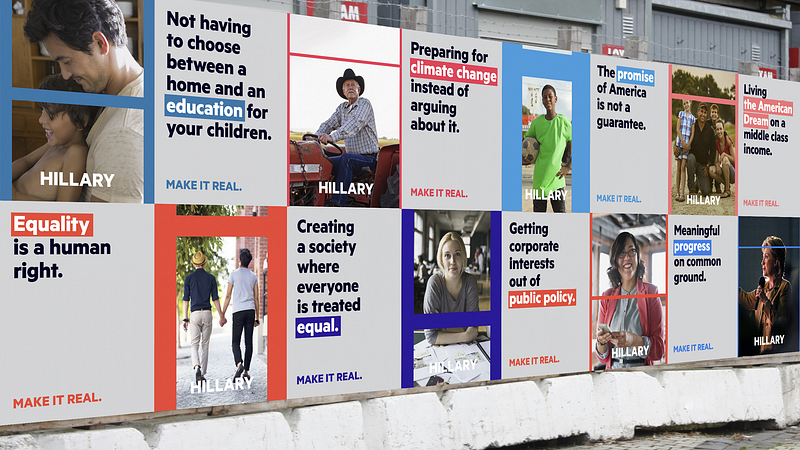
But what if a political logo used a different color palette? In Moving Brands’ fascinating exercise reimagining the Clinton visual identity, they came up with a more “contemporary” palette:
The new campaign’s boldest decision was to ditch the stereotypical red, white, and blue of the American flag, which, while traditional (in fact, the team came across some pins that FDR had used in 1932 that looked “exactly the same” as what we use today), seemed too tired for a progressive candidate. Instead, they opted for an electric red and blue — a contemporary remake halfway between an American flag and a 1980s seafoam and pink color palette.
“It was also how we [tacitly] addressed the fact that Hillary has a good chance of being the first female president,” Meyer explains. “Historically, that’s significant, but Hillary does not play the gender card. The palette is unisex, but warm and optimistic.”
Look at that! Those colors really do differentiate this hypothetical Hillary from your typical campaign, don’t they?

But scanning that wall of posters, I have to think it takes a closer read to tell this is a politician’s brand. Is that good or bad?
Bigger Stakes: Emotions
Colors are a uniquely powerful shorthand for evoking emotions in people. By going with the old standby, you waste the opportunities in a fuller palette. That said, there are times when evoking the colors of the flag really does express something important for a candidate.
Barack Obama, for example, has unfairly faced relentless questioning of his authenticity as an American due to the color of his skin; sadly, his campaigns probably did benefit from a color palette that subtly reinforced his Americanness. Other candidates, such as General Wesley Clark in 2003, use their service under the flag as a pointed differentiator.
But for most presidential candidates, it might be worth taking another look at the power of colors to evoke emotions and values.
Perhaps a challenger candidate needing to grab attention with an optimistic message would benefit from using yellow:
Cheerful sunny yellow is an attention getter. While it is considered an optimistic color, people lose their tempers more often in yellow rooms, and babies will cry more…Yellow enhances concentration, hence its use for legal pads.
Perhaps a candidate who is emphasizing authenticity and needs to recruit male votes would benefit from using light brown:
Solid, reliable brown is the color of earth and is abundant in nature. Light brown implies genuineness while dark brown is similar to wood or leather. Brown can also be sad and wistful. Men are more apt to say brown is one of their favorite colors.
And so on and so forth. It’s not hard to find a lot more information on what different colors communicate. Obviously the unique characteristics of the candidate and context of the race should play a big factor in choosing any more daring colors, but general principles of cognitive politics, such as Moral Foundations Theory, are definitely worth paying attention to.
According to Moral Foundations Theory, people on the left respond better to arguments framed around Care and to a certain extent Fairness and Liberty. Meanwhile, people on the right respond better to arguments framed around the Loyalty, Authority, and Sanctity/Purity.
Using colors that evoke the right moral foundations in people’s brains could be a big advantage. Is it really worth ceding that advantage just so people know you’re patriotic or recognize you’re a campaign?
It’s Time to Grow Up
Never has differentiation been more important than in a race of more than a dozen presidential candidates. It shouldn’t be that hard to break the mold — heck, you see other color combinations all the time on down-ticket races.

Maybe once you get to the presidential level, the stakes are so high that everyone is just that much more risk averse. Maybe choosing red, white, and blue is the equivalent of the old stock broker saying, “No one ever got fired for buying IBM.”
Note that IBM itself uses a plain blue logo, about as risk-averse a color choice as you can make. That’s fine if you’re IBM — in other words, if you’re the big dog, the front runner. But if you’re the upstart or if you’re on the fringe, it’s up to you to make people take notice. In a winner take all market like electoral politics, it doesn’t matter if people recognize your category right away if you can’t excel within it.
So maybe Clinton and Jeb! didn’t need to take risks with their color choices, but if I were any of those other candidates fighting for attention, I sure would have wanted to stand out. Surely someone will seize the power of color at the presidential level one day, though. Right?

אין תגובות:
הוסף רשומת תגובה