David Aaker
I have written and spoken on the importance of having brand energy, organizational values, a brand personality, and a point of difference so compelling that it forms a new subcategory. What is also true, is that a brand can develop substantial loyalty by just doing its job. Just do the basics: Deliver the brand promise. Don’t screw up and provide a reason to consider the competition. It turns out that people like brands that work…and question those that don’t.
I was again reminded of this fact when analyzing the Prophet Brand Relevance Index™. The 2016 U.S. survey tested the relevance of 325 top brands from 29 categories using respondents that were active in the category and familiar with the brand. The survey ranks brands across four dimensions: Innovation, Customer Obsession, Inspiration and Pragmatism. Two surprising results emerged regarding the Ruthlessly Pragmatic dimension, which measured ease-of-use and dependability.
Two Surprising Results from Top Pragmatic Brands
Fourteen of the top 25 brands measured on the Ruthlessly Pragmatic dimension were commonly used consumer brands such as Clorox (3), Ziploc (5), Band Aid (8), Tide (9), VISA (12), Crest (13), Kleenex (14), Dove (15), Betty Crocker (20), KitchenAid (22), Colgate (23), and Campbell’s (24). Nine of these ranked in the top 25 on trust, as well. All of these brands were in the top 75 on the overall relevance scale, ten were in the top 50 and 3 in the top 25. It is rather incongruous to see some commonplace, older brands that are not known for being dynamic (although if you look closely, they are innovating at a rapid pace) in such a rarified atmosphere. However, they all deliver on their promise, rarely disappoint and have earned remarkable brand strength.
An even more surprising result, is the Ruthlessly Pragmatic dimension’s power among high-tech brands, the strongest in the survey. In fact, four of the top six brands in the survey were tech companies: Apple (1), Amazon (2), Android (3) and Google (6). We expect these brands to be strong, driven by the other dimensions such being pervasively innovative, customer obsessed or distinctively inspired. But it turns out that the ability to deliver in an easy, reliable manner is one of the qualities that pushes these brands to the top.
Amazon, who leads the retail segment by a huge margin, gets the highest marks from consumers for being available and dependable. To run such a complex service and do it so well, living up to the brand promise, is really astonishing and the company is rewarded with brand strength. The Apple iPhone and Android are visible and functionally enable customers due to their role in people’s lives. Google is given difficult assignments by their users and nearly always comes through with their search, maps and more. And both just work. Netflix’s platform is engaging and easier to use than others, delivering on another complex task. All these brands deserve a lot of credit for simplifying a complex offering and making it work so well.
I am reminded of a book, Simply Better by Patrick Barwise and Sean Meehan. In the book, the authors argued that success is achieved by delivering basic category benefits better than others. Even for complex or high-tech product and services, strategy is second tier to exceptional execution and consistently delivering positive customer experiences.
There is much to be said for sticking to the basics of a brand to deliver its promise. That task should be first priority and can be used to create brand strength through loyalty, and also a lack of a reason to change. It can also be the platform for other customer connections that will drive growth and yield an even stronger brand.
The strongest brands are the ones that are relentlessly relevant and making a difference in consumers’ lives. Find out why Prophet ranks based on relevance.
יום חמישי, 29 בדצמבר 2016
Be Ruthlessly Pragmatic and Deliver on Your Promise
תוויות:
comunication,
countrybranding,
facebook,
joven,
marcapolitica,
marcas,
marketing,
millenials,
political,
ruben,
rubén,
twitter,
voto,
votojoven,
weinsteiner,
youngvote,
youthvote
יום רביעי, 28 בדצמבר 2016
Interview with José Fernández-Cavia, Pompeu Fabra University, Barcelona

Meet José Fernández-Cavia, Head of Department of Communication at Pompeu Fabra University in Barcelona. In this interview he shares some findings of his recent research examining the use of digital media, such as websites and mobile applications and its increasing importance surrounding place brands and destination branding.
Learn about:
The current state of digital media and its intersection with place branding,
Advice for emerging researchers interested in the area of destination branding,
Current trends in destination branding research.
José, your current research focuses on online communication for destination brands. What are your thoughts on the current state of digital media and its intersection with places and destination branding research?
The Internet has become the primary source of information for most travelers in the world, particularly among young people and experienced travelers who are not dependent on intermediaries, capable of organizing the trip by themselves. So destinations must have a powerful and appealing presence online.
One key finding from my research during the last years is that destination branding strategies are too dependent on the marketing perspective and that a communications or a public relations angle can drastically improve the performance of destination brands.
Destination Marketing Organizations (DMOs) are frequently lacking communication professionals, and often base their communication strategies on a trial-and-error basis. Of course, there are exceptions.
In your position as Head of the Communication Department at Universitat Pompeu Fabra, what advice can you share with emerging researchers interested in destination branding?
Well, at least from my point of view, destination branding is an interdisciplinary field of study that combines tourism and communication. Branding is all about communication. It consists primarily of conveying to the people’s minds the associations we want to link to a name and a logo. So my piece of advice is to focus not only on tourism and marketing, but also include communication.
In our applied research projects, we have demonstrated that too many destination managers are illiterate in communication, with the consequence that their work is not as efficient as it could be.
Over the next six months, you will join The Place Brand Observer as Academic Observer. What focus areas might we hope to read about in the coming months?
My educational background and teaching experience are in advertising and public relations, so my focus will be on brands, promotion tools, and online communication. Specifically, my primary field of research for the past few years has been destination websites, and how to assess their quality. But I’m also planning to tackle topics such as global events or the links and differences between place branding and public diplomacy.
Which are the best academic journals for place branding and destination branding scholars to follow?
Well, first of all, the only one that has the words place branding in the journal’s title is Place Branding and Public Diplomacy, edited by Robert Govers and Nick Cull. But there are a significant number of journals in the business, tourism and communication fields that have devoted some monographs or individual papers to the topic.
Those include:
Journal of Destination Marketing and Management
Journal of Place Management and Development
Catalan Journal of Communication and Cultural Studies
International Journal of Communication
Communication & Society
Urban Studies
Cities
Tourism Management
What current trends are you seeing in destination branding research?
Some of the most valuable recent research has to do with how to manage a destination brand not only from a tourist perspective but a global and holistic one. Focusing only on business and attracting visitors can be a big mistake in the long run. Cities, regions, and countries must act strategically to combine their search for financial profit and economic growth with the well-being of their societies.
Besides that, I’m especially interested in how a powerful brand can help places to achieve their goals.
Tourism is a driving force for the regeneration, promotion, and development of territories. Making the place attractive to leisure or business travelers usually implies that it is also becoming more attractive to residents, international students or investors.
Some well-known examples of cities – Bilbao, Cardiff, Berlin, Buenos Aires – or countries – New Zealand, Singapore, United Arab Emirates, Peru – have tried to use their tourism momentum to allocate investments for infrastructure, heritage preservation, cultural equipment or new residential and commercial areas.
Which (social) media do you follow for updates on latest place branding insights and trends?
Well, to begin with, I must say I think it’s not a matter of being aware of the “latest” insights, but of the “most valuable.” In my opinion, we shouldn’t worry so much about being updated daily. Instead, we should concern ourselves more with being able to separate the wheat from the chaff.
Relevant ideas linger and prevail, and are not ephemeral.
That being said, I use Twitter for receiving news, some blogs as TPBO, academic papers and –surprisingly enough– books!
יום שלישי, 27 בדצמבר 2016
Obama: I could have won a third term

President Barack Obama said he believes his 2008 message of hope and change still could have worked in 2016.
The president says the message of hope and change he campaigned on in 2008 still resonates in 2016.
President Barack Obama still believes in the message of “hope and change” he campaigned on in 2008 — so much so that he believes it could have delivered him a third term over Donald Trump had the Constitution allowed him to run again.
“I am confident in this vision because I’m confident that if I — if I had run again and articulated it, I think I could’ve mobilized a majority of the American people to rally behind it,” Obama told his former senior adviser, David Axelrod, on Monday’s “Axe Files” podcast. “I know that in conversations that I’ve had with people around the country, even some people who disagreed with me, they would say the vision, the direction that you point towards is the right one.”
Obama campaigned vigorously for Hillary Clinton, his former secretary of state, dispatching himself, Vice President Joe Biden and first lady Michelle Obama across the country on Clinton’s behalf. It would be a “personal insult” to his legacy, he said during the campaign, if the black community didn’t support Clinton. All of his administration’s accomplishments would be reversed under a President Trump, he warned. Progress and hope, he argued, were on the ballot, although his name was not.
But it was all for naught.
Republicans successfully painted Clinton as a corrupt, dishonest politician who was running for Obama’s third term despite, they insisted, putting America’s national security at risk when she set up a private email server as head of the State Department. She belonged in jail, some said. Others accused her of using her family nonprofit as a slush fund and argued that the longtime politician was the quintessential emblem of the status quo, not the change agent she portrayed herself to be.

Trump: 'No way' I would have lost to Obama
By Nolan D. McCaskill
And Trump, who vanquished a crowded field of 16 additional Republicans — including current and former senators and governors — before toppling Clinton, is skeptical that anyone could have bested him, including an incumbent president.
“President Obama said that he thinks he would have won against me,” Trump tweeted Monday afternoon. “He should say that but I say NO WAY! - jobs leaving, ISIS, OCare, etc.”
Trump railed against Obama and Clinton’s policies on the campaign trail. He ran on the promise of repealing and replacing Obamacare, dubbed Obama and Clinton the founders of the Islamic State and slammed them for having supported free trade policies like the Trans-Pacific Partnership and NAFTA.
Clinton prevailed in the popular vote, winning nearly 3 million more ballots across the country than Trump. But it was Trump's improbable campaign that won the requisite number of Electoral College votes to be elected president, and he maintains he could have won the popular vote, too, had that been his aim.
By Obama’s assessment, Clinton performed “wonderfully under really tough circumstances.” But there were problems: Obama accused the media of “wildly” amplifying Clinton’s flaws because of a double standard and said Democrats weren’t on the ground where they needed to be to show people in rural communities that the Democratic Party cares about them, too.
“There’s an emotional connection, and part of what we have to do to rebuild is to be there, and that means organizing, that means caring about state parties, it means caring about local races, state boards or school boards and city councils and state legislative races and not thinking that somehow, just a great set of progressive policies that we present to the New York Times editorial board will win the day,” Obama told Axelrod.
Now, with Trump weeks away from being sworn in as the next president, the theme of “hope” that carried the Obamas into the White House in 2008 has emerged as the concept they’re tightly grasping on to as they transition out eight years later.
“See, now, we’re feeling what not having hope feels like,” Michelle Obama told Oprah Winfrey in her own exit interview broadcast last week.
The first lady cast hope as a “necessary concept” that wasn’t just a nice slogan for votes but something she and her husband believe in.
For his part, Trump told supporters at a thank-you rally in Mobile, Alabama, that they have “tremendous hope” and suggested the first lady “made that statement not meaning it the way it came out.”
It is Trump, after all, who appears to represent the change Americans want today. Eschewing political correctness and largely self-funding his primary campaign, Trump was undeniably a shift from the status quo. Voters hoped he would come to Washington, shake things up and “drain the swamp,” as he said on the trail.
In Monday’s podcast, Obama credited Senate Majority Leader Mitch McConnell for Republicans’ obstruction throughout his entire administration, an effort, he argued, that was meant to obscure the hope and change he campaigned on by rejecting his policies outright and creating stagnation.
תוויות:
airbnb,
blue,
comunication,
countrybranding,
facebook,
joven,
marcapolitica,
marcas,
marketing,
millenials,
political,
ruben,
rubén,
twitter,
voto,
votojoven,
weinsteiner,
youngvote,
youthvote
יום ראשון, 25 בדצמבר 2016
How Barclays Defined Brand Purpose and Regained Customer Trust
What can be done to regain brand trust when it has been damaged by a real or perceived firm misstep? And more aggressively and strategically, what can be done to create an organization where such errors are less likely and customer understanding and forgiveness is more likely? Many brands (Volkswagen, Wells Fargo, Toshiba and Samsung) have recently faced this exact challenge.
There are, of course, many tactical prescriptions for dealing with a trust-damaging crisis, but there are three courses of action brands can enact in advance as protective measures:
Create a higher purpose mission, value set or culture that will enable the organization to have meaning apart from generating sales and profits.
Develop a higher purpose program or set of programs that not only engenders trust, but can redirect the discussion during a crisis incident. These programs should be oriented toward social good, leverage the organization’s people and assets and be branded and visible.
Distribute messages about the brand’s higher purpose using at least, in part, stories of real people.
Barclays Responds to a Brand Crisis
A warc case study, written by Tom Roach of BBH London, addressed Barclays response to its brand crisis following the 2009 financial crash. In June 2012, the brand received a very visible fine for falsely reporting the interest rates (LIBOR) they were paying to other banks. This act, which had been common practice for years, made the company’s financial position appear better than it was.
Though many global banks were investigated and ultimately punished for doing the same thing, Barclays was the first. The brand was harshly judged by the public and assumed to be partially responsible for the financial collapse. The result was a plunge in brand trust, a key driver of customer loyalty in the banking industry. Barclays trust level, which was already low, plummeted during 2011 and 2012 by 60% (compared to 85% among competitors). One study found Barclays was the least trusted brand in the least trusted sector. Barclays decided to change.
Developing a new brand purpose
In February 2013, the Barclays Group CEO announced that the company would dramatically change and assume a new brand purpose: “Helping people achieve their ambitions—in the right way.” To support the new brand purpose Barclays developed five brand values, including respect for employees and stewardship. A total of 140,000 employees participated in an extensive training and evaluation system linked to the new brand purpose and values, which effectively transformed the culture of the firm.
Implementing new programs
The newly empowered and inspired employees were encouraged to create and lead higher purpose programs, and they did so in volumes. One, led by 12 colleagues dubbed the “Digital Eagles”, helped employees who lagged in digital/technical proficiency to upgrade their skillset. This program has now reached 12,000 employees and has expanded to include “Tea and Teach” sessions where the general public can learn how to survive and thrive in the digital world. The Digital Eagles also launched an online program, Digital Wings, allowing people to grow from “Newbie” to “Brainbox” in a series of engaging and informative courses.
Among the more than 40 programs developed in this initiative, four programs were dedicated to ensuring that none are left behind in the digital revolution: Code Playground is a workshop held at Barclays branches that teaches kids the basics of computer coding, Life Skills provides young people with an in-school and online learning program that helps to develop the skills needed to get jobs in a digital workplace and Fraud Smart gives free help and advice to people who need to keep money secure in a digital world.
Creating fresh brand communication
In June 2014, product-based communication was replaced with a campaign that shined a light on Barclay’s higher purpose initiatives, featuring the four digital driven programs, using real stories from real people. The results were amazing.
From the start of the campaign through early 2016, most key indicators were tracking upwards. In particular, trust was up 33%, emotional connection was up 35% (vs 5% for the category average), the NPS (net promoter score) was up 300%, consideration was up 130%, “easy to deal with” was up 50% and “reassurance that your finances are secure” was up 46%.
New brand purpose yields results
The results of this campaign were dramatically different than the product campaign that preceded it. For example, the new campaign drove 6 times as much trust and 5 times as much consideration. The programs featured in the campaign were positively impacted as well. The Digital Eagles and the Code Playground campaigns, for example, each resulted in well over 120,000 unique visitors to the webpage and received 1.5 million video views (since the campaign these numbers are much higher). The press sentiment had changed from being highly critical, to overwhelmingly positive. By 2015 Barclays received 5,000 positive mentions in the press (including 600 about Life Skills).
Barclays recovered brand trust by forcing a culture change that empowered and inspired employees and yielded higher purpose programs, brought to light with stories about real people. The brand shifted consumer perception by amplifying the stories of real people who were impacted by the programs and altered the conversation by providing a more positive narrative about the brand.
Such an effort does not have to be employee led. For an example of a CEO-led higher purpose program that changed the conversation about a brand, read my book, Aaker on Branding. In the book I share a Walmart CEOs successful effort to become a leader in environmental programs resulting in the article headline: “It’s hard to hate Walmart anymore.”
תוויות:
airbnb,
blue,
comunication,
countrybranding,
facebook,
joven,
marcapolitica,
marcas,
marketing,
political,
ruben,
rubén,
twitter,
voto,
votojoven,
weinsteiner,
youngvote,
youthvote
The Best And Worst Branding Of 2016
We revisit the highs, the lows, the most-Tweeted about. Here are our picks for the best and worst identity design this year.
![]()
It has never been harder to design a good visual identity. Brands live on dozens of platforms, so they have to look as good on a billboard as they do on a phone screen. Armchair critics emboldened by the ease of the web attack change no matter how necessary, skewing clients toward less ambitious work. And yet the companies below managed to eke out thoughtful, even occasionally daring, new visual identities this year. Of course not everyone hit the mark. Here, we take you through a year of branding—the good, the bad, and the most controversial.
The Best
Grubhub
Grubhub may have started out as a small startup, but in 2016, the 12-year-old company services 7 million people and 44,000 restaurants. It needed a grown-up redesign: a look that was authentic yet polished and one that would work on both a national and hyper-local level. Wolff Olins took on the task and rebranded the company, populating ads with lifestyle photos (think Airbnb ads and Apple commercials) and hand-drawn lettering, and adding chef highlights, animated food items, and a custom keyboard of GrubHub "mmmojis" to the site. Overall, the new look is fresh and professional, but retained some of the scrappy personality of its earlier paper cut-out illustrations. The hope is that it will persuade the shrinking, but still sizable population of people who still prefer placing delivery orders over the phone to switch to the web.
MasterCard
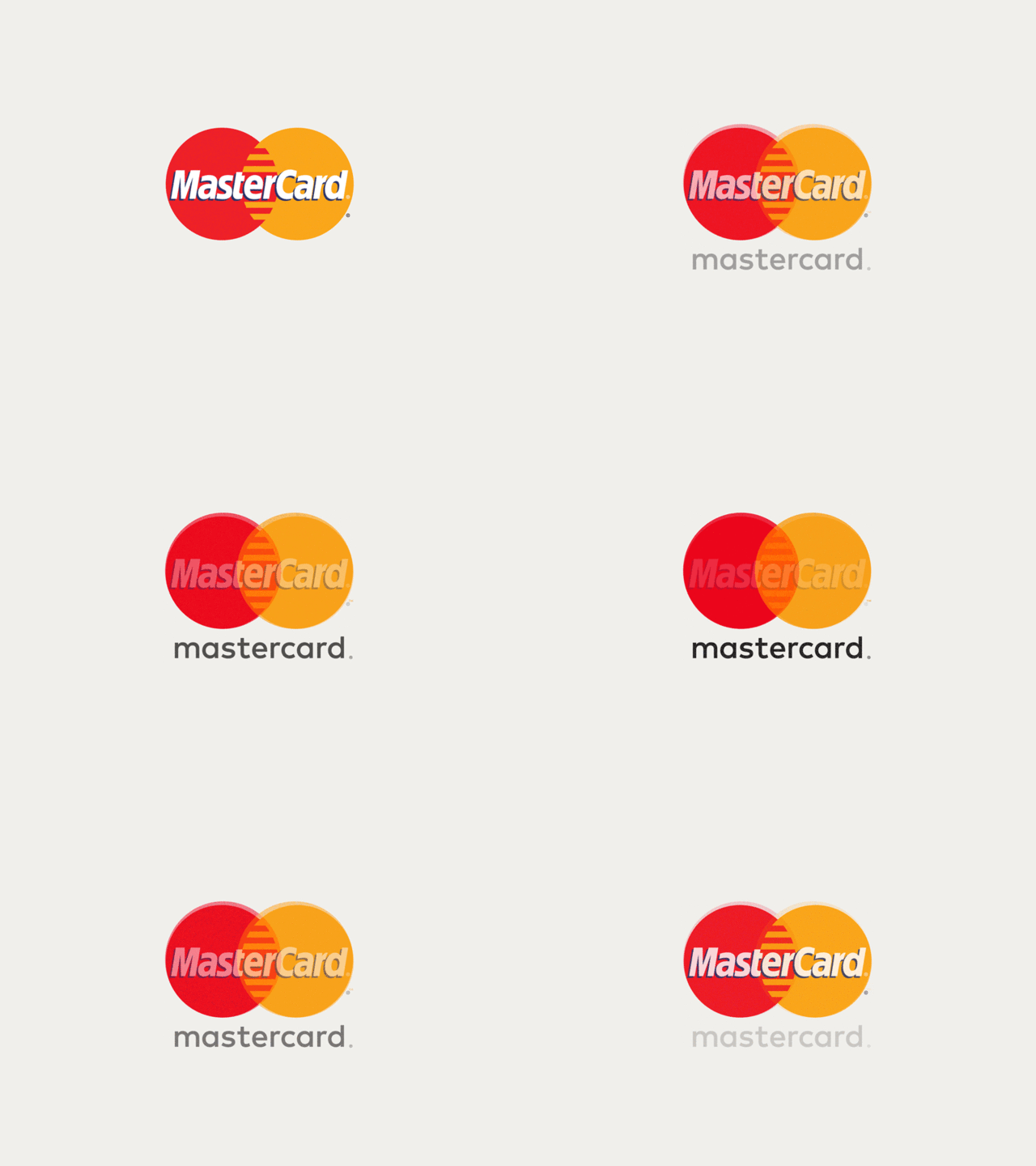
Before this year the MasterCard logo hadn't changed significantly in 20 years, but the way that we buy and pay for things certainly had. Tasked with the company's first major redesign in two decades, Pentagram partner Michael Bierut and designer Hamish Smyth refrained from making drastic changes to the familiar overlapping yellow and red circles in the logo—instead opting to modernize it by removing the comb effect in the center and placing the wordmark outside of the symbol. With the option to just use the familiar symbol without the wordmark, the system is flexible enough to work across multiple products and platforms, like the MasterPass digital payments and Priceless rewards program. The logo is also optimized to work well on mobile, the direction most of our bank transactions have been going.
Helia
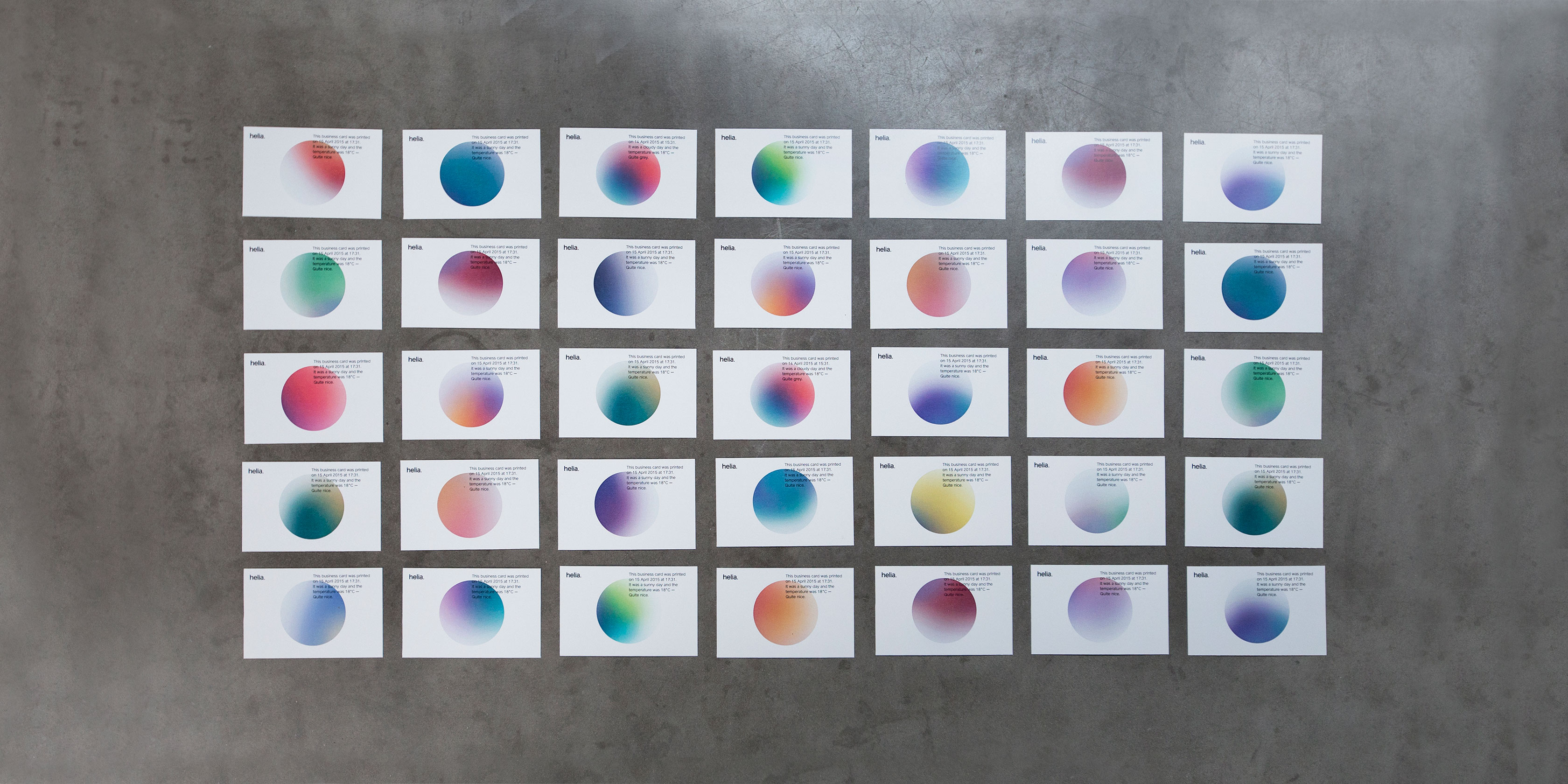
Sometimes it's the lesser-known companies that pack the biggest punch with a stellar redesign. Such was the case with Helia, a data science and analytics company whose client roster includes companies like Unilever, easyJet, IBM, Diageo, and Sony PlayStation. Designed by the New York-based design firm Form&, the identity system centers around a simple circular logo imbued with a gradient that changes colors based on weather and geographic data. In that way, in both the print and digital form, the color of the logo serves as a unique data stamp. The eye-catching redesign brings a company that typically works behind-the-scenes front and center.

Instagram
In May, Instagram shocked the internet when it unveiled a pared-down, rainbow-gradient upgrade to its Polaroid icon. But the new icon contained some clever details: an image that referenced photography's evolution away from film-based cameras to phones, and a rainbow gradient that made the icon pop in a sea of other icons (and subtly referenced the rainbow stripes of the old icon). Not surprisingly, the fervor quickly subsided. Now your thumb gravitates instinctively toward the icon on your phone dashboard without a passing thought given to the skeuomorphic old one (there's no need to reference analog cameras in an app for your iPhone cam).

Zendesk
The customer service software provider Zendesk offers one of the most drastic before-and-after logo stories: from a cartoonish smiling Buddha on a chat headset to a sleek system of geometric shapes. The identity retained its playfulness, though, with each Zendesk service receiving an iteration of the logo that has its own animated personality. The Help Center, for example, is two arrows, one leading the other. The logo for Support is a tall rectangle leaning on a shorter one. The best part might be when you realize why this charming shape system is so familiar: It was inspired by wooden toy blocks from the founder's Danish childhood.
Zocdoc
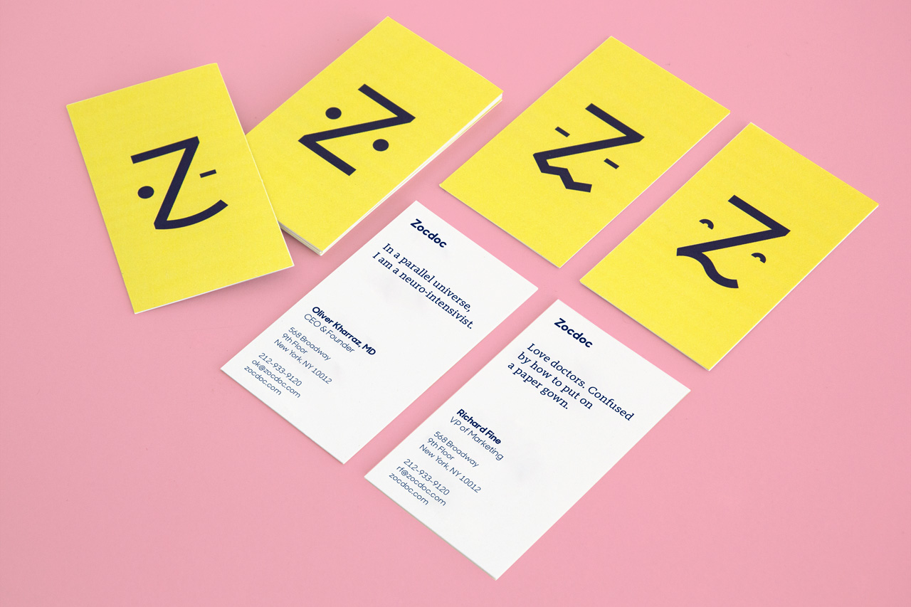
Health care platform Zocdoc launched in 2007 with a staid, traditional logo that the company's founders bought for a mere $80. Now that the business is valued at $1.8 billion and is rapidly expanding its model to connect patients with hospital systems as well as individual practitioners, it figured it could afford something new. Wolff Olins did the redesign: a friendly, human-centered identity with a cute little anthropomorphic logo that turns the letter Z into a emoticon-like face, who goes by "Zee." The responsive Zee gets it: He can look puzzled, sad, relieved, happy. He too experiences the roller-coaster ride of emotions you go through when you're sick and struggling to recall the details of your health care co-pay, all while trying to book an appointment today, not three weeks from now.

VSCO
VSCO, the popular image editing app, got a major redesign this year, of both its user interface (launched in June) and its visual identity (launched in February). The identity redesign was based around a custom-made VSCO Gothic typeface and a system of slick yet emotive symbols that construct a visual alphabet of sorts. The new circular logo is meant to embody the global community that now uses the app not just for editing, but also as a photo-sharing platform. VSCO is like an artier Instagram, with a user base of mostly professional and amateur photographers. The new black, white, and dusty pink design reflects its trendiness, but in a way that is crisp and polished.
The Most Controversial
The Met
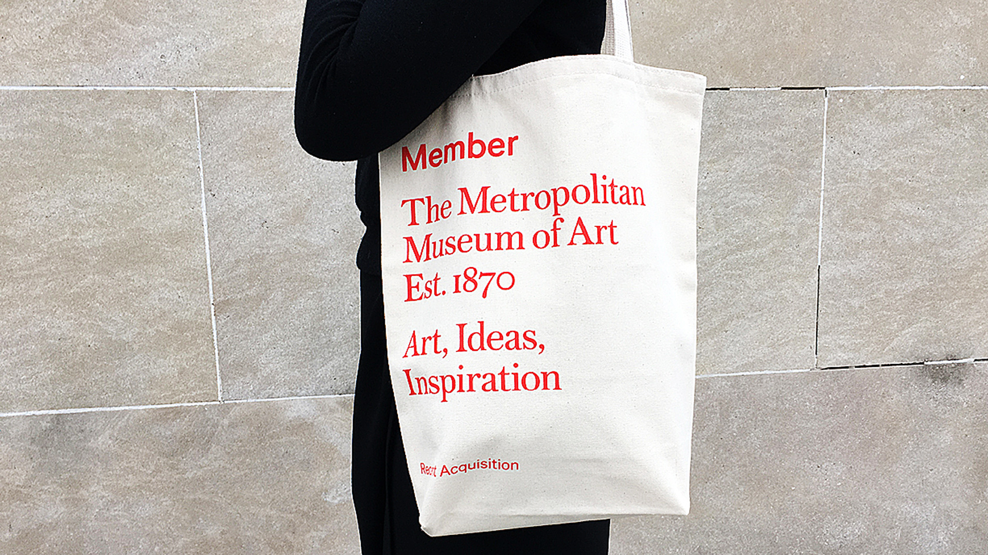
This year, the award for the rebrand that drew the most outrage goes to the Metropolitan Museum of Art. The Met overhauled its logo and identity system—much to the chagrin of many design critics—and revealed a new logo that rebrands the museum as "The Met." The two words, stacked on top of each other in large scarlet lettering, replaced the stylized M logo originally taken from a woodcut by Luca Pacioli. Wolff Olins did the identity, but the rollout was botched when the museum sent out press materials with the new logo before it was announced. Identities tend to get judged harshly when they are launched sans explanation—especially changes as major as this one—but it's been 10 months and the logo has already worn in nicely. We like the bold new design, and we're glad it stuck around long enough for the dust to settle.
The Worst

Uber
When Uber's new icon came out in February, it was widely ridiculed. It looked like PacMan. An asshole. A "little kind of bluish sideways ass." Wired dedicated considerably more words to the icon with a behind-the-scenes look, during which Uber CEO Travis Kalanick said he kept the design in-house because he didn't trust anyone else to do it for him. Bad call, Kalanick. The icon managed to look both soullessly corporate and overworked. It was also poorly executed. Yet, just like the (better, more thoughtful) Instagram redesign, the Uber icon shows how quickly these controversial rebrandings are normalized—particularly with apps we interact with so much that their use becomes almost subconscious.
Trump-Pence Logo
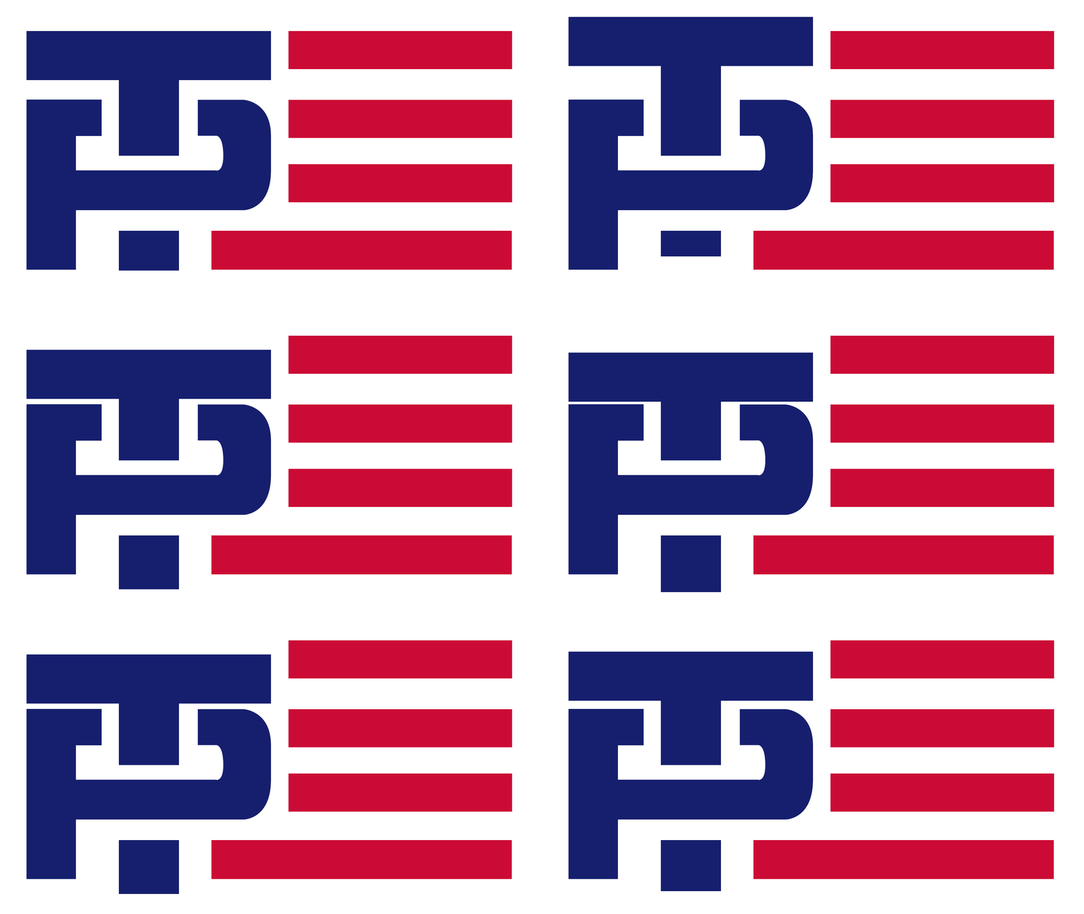
Well, here we are: the absolute worst brand design of the year. We wish we didn't have to bring this pair up, but there's no getting around the fact that the Trump-Pence logo takes the prize. The animation above says it all, but Twitter said it pretty well, too. The campaign buckled under the online mockery, pulled the logo, and replaced it with something less suggestive, but it was too late. The image is seared into our minds forever. With Trumpistan looming, you'll want to keep this GIF close—a memento from simpler times.
Related Video: How To Build A Strong Brand Without Constantly Thinking About Branding
It has never been harder to design a good visual identity. Brands live on dozens of platforms, so they have to look as good on a billboard as they do on a phone screen. Armchair critics emboldened by the ease of the web attack change no matter how necessary, skewing clients toward less ambitious work. And yet the companies below managed to eke out thoughtful, even occasionally daring, new visual identities this year. Of course not everyone hit the mark. Here, we take you through a year of branding—the good, the bad, and the most controversial.
The Best

Grubhub
Grubhub may have started out as a small startup, but in 2016, the 12-year-old company services 7 million people and 44,000 restaurants. It needed a grown-up redesign: a look that was authentic yet polished and one that would work on both a national and hyper-local level. Wolff Olins took on the task and rebranded the company, populating ads with lifestyle photos (think Airbnb ads and Apple commercials) and hand-drawn lettering, and adding chef highlights, animated food items, and a custom keyboard of GrubHub "mmmojis" to the site. Overall, the new look is fresh and professional, but retained some of the scrappy personality of its earlier paper cut-out illustrations. The hope is that it will persuade the shrinking, but still sizable population of people who still prefer placing delivery orders over the phone to switch to the web.

MasterCard
Before this year the MasterCard logo hadn't changed significantly in 20 years, but the way that we buy and pay for things certainly had. Tasked with the company's first major redesign in two decades, Pentagram partner Michael Bierut and designer Hamish Smyth refrained from making drastic changes to the familiar overlapping yellow and red circles in the logo—instead opting to modernize it by removing the comb effect in the center and placing the wordmark outside of the symbol. With the option to just use the familiar symbol without the wordmark, the system is flexible enough to work across multiple products and platforms, like the MasterPass digital payments and Priceless rewards program. The logo is also optimized to work well on mobile, the direction most of our bank transactions have been going.

Helia
Sometimes it's the lesser-known companies that pack the biggest punch with a stellar redesign. Such was the case with Helia, a data science and analytics company whose client roster includes companies like Unilever, easyJet, IBM, Diageo, and Sony PlayStation. Designed by the New York-based design firm Form&, the identity system centers around a simple circular logo imbued with a gradient that changes colors based on weather and geographic data. In that way, in both the print and digital form, the color of the logo serves as a unique data stamp. The eye-catching redesign brings a company that typically works behind-the-scenes front and center.
In May, Instagram shocked the internet when it unveiled a pared-down, rainbow-gradient upgrade to its Polaroid icon. But the new icon contained some clever details: an image that referenced photography's evolution away from film-based cameras to phones, and a rainbow gradient that made the icon pop in a sea of other icons (and subtly referenced the rainbow stripes of the old icon). Not surprisingly, the fervor quickly subsided. Now your thumb gravitates instinctively toward the icon on your phone dashboard without a passing thought given to the skeuomorphic old one (there's no need to reference analog cameras in an app for your iPhone cam).

Zendesk
The customer service software provider Zendesk offers one of the most drastic before-and-after logo stories: from a cartoonish smiling Buddha on a chat headset to a sleek system of geometric shapes. The identity retained its playfulness, though, with each Zendesk service receiving an iteration of the logo that has its own animated personality. The Help Center, for example, is two arrows, one leading the other. The logo for Support is a tall rectangle leaning on a shorter one. The best part might be when you realize why this charming shape system is so familiar: It was inspired by wooden toy blocks from the founder's Danish childhood.

Zocdoc
Health care platform Zocdoc launched in 2007 with a staid, traditional logo that the company's founders bought for a mere $80. Now that the business is valued at $1.8 billion and is rapidly expanding its model to connect patients with hospital systems as well as individual practitioners, it figured it could afford something new. Wolff Olins did the redesign: a friendly, human-centered identity with a cute little anthropomorphic logo that turns the letter Z into a emoticon-like face, who goes by "Zee." The responsive Zee gets it: He can look puzzled, sad, relieved, happy. He too experiences the roller-coaster ride of emotions you go through when you're sick and struggling to recall the details of your health care co-pay, all while trying to book an appointment today, not three weeks from now.

VSCO
VSCO, the popular image editing app, got a major redesign this year, of both its user interface (launched in June) and its visual identity (launched in February). The identity redesign was based around a custom-made VSCO Gothic typeface and a system of slick yet emotive symbols that construct a visual alphabet of sorts. The new circular logo is meant to embody the global community that now uses the app not just for editing, but also as a photo-sharing platform. VSCO is like an artier Instagram, with a user base of mostly professional and amateur photographers. The new black, white, and dusty pink design reflects its trendiness, but in a way that is crisp and polished.

The Most Controversial
The Met
This year, the award for the rebrand that drew the most outrage goes to the Metropolitan Museum of Art. The Met overhauled its logo and identity system—much to the chagrin of many design critics—and revealed a new logo that rebrands the museum as "The Met." The two words, stacked on top of each other in large scarlet lettering, replaced the stylized M logo originally taken from a woodcut by Luca Pacioli. Wolff Olins did the identity, but the rollout was botched when the museum sent out press materials with the new logo before it was announced. Identities tend to get judged harshly when they are launched sans explanation—especially changes as major as this one—but it's been 10 months and the logo has already worn in nicely. We like the bold new design, and we're glad it stuck around long enough for the dust to settle.
The Worst

Uber
When Uber's new icon came out in February, it was widely ridiculed. It looked like PacMan. An asshole. A "little kind of bluish sideways ass." Wired dedicated considerably more words to the icon with a behind-the-scenes look, during which Uber CEO Travis Kalanick said he kept the design in-house because he didn't trust anyone else to do it for him. Bad call, Kalanick. The icon managed to look both soullessly corporate and overworked. It was also poorly executed. Yet, just like the (better, more thoughtful) Instagram redesign, the Uber icon shows how quickly these controversial rebrandings are normalized—particularly with apps we interact with so much that their use becomes almost subconscious.

Trump-Pence Logo
Well, here we are: the absolute worst brand design of the year. We wish we didn't have to bring this pair up, but there's no getting around the fact that the Trump-Pence logo takes the prize. The animation above says it all, but Twitter said it pretty well, too. The campaign buckled under the online mockery, pulled the logo, and replaced it with something less suggestive, but it was too late. The image is seared into our minds forever. With Trumpistan looming, you'll want to keep this GIF close—a memento from simpler times.
Related Video: How To Build A Strong Brand Without Constantly Thinking About Branding
תוויות:
airbnb,
blue,
comunication,
countrybranding,
facebook,
joven,
marcapolitica,
marcas,
marketing,
political,
ruben,
rubén,
twitter,
voto,
votojoven,
weinsteiner,
youngvote,
youthvote
CEO's personal brand is vital
“Your brand is the single most important investment you can make in your business,” according to Steve Forbes.
However, what Forbes failed to clarify is that a business has three separate brands to consider; its consumer brand, its employer brand and its CEO’s brand.
And, according to a recent study of 1000 UK citizens conducted by Prophet, the latter should not be underestimated.
Dev Modi, Associate Partner at Prophet, highlights four key findings that illustrate the importance of a Chief Executive’s personal brand to the business…
1. Profits
It is a given that customers are less likely to buy from a brand that they dislike - but the same goes for the CEO too. According to Prophet, 68% of people said they will not buy a product/service if the CEO’s personal conduct is revealed to be unethical.
Modi says: “When expectations are met or exceeded, a place upon a pedestal awaits. However, when performance, behaviour or results fall short, uncertainty abounds. And where a leader is viewed with uncertainty, there’s certainty of a tumble in the share price.
“Major brands have faced perilous financial positions brought about as a direct result of a CEO’s actions, the most notorious being Fred the Shred of RBS, with consequences so dire, a complete re-brand of the bank was essential.
“Yet it’s not only direct actions and words that can hit sales, profit and growth - others are deemed villainous by association, as has been shown with the boycotting of Ivanka Trump’s products by a vociferous Twitter campaign.”
2. Talent attraction
The CEO’s brand also has a strong impact on the company’s employer brand too. Prophet’s study shows that 77% are attracted to work for an organisation where the CEO has a strong, positive personal brand.
“When a leader’s brand is promoted intelligently, consumer attention can be secured and top talent can be attracted,” says Modi.
He gives the example of Sacha Romanovitch, CEO of Grant Thornton and the first female leader of a top accountancy firm in the UK: “She brings lashings of personality that gets lapped up by the media, adding value to her company in an otherwise grey industry. She also attracts other leading women in her field, creating a competitive edge for her firm.”
He continues: “With the heroes established, by stark contrast, the villains emerge; leaders who become embroiled in scandal and media revelations impact not only consumer perception, but the perceptions of potential candidates. When faced with a competitive market, one in which companies must reinvent, innovate and evolve, the CEO’s ethics and personal conduct directly relate to their profitability.”
3. Employee retention
But it is not just attracting employees that is impacted by a CEO’s brand, it is also retaining them. And although employees of larger businesses may not even come across their CEO, Prophet’s findings indicate that 67% would consider leaving an organisation because of the negative example of the Chief Executive.
Modi explains: “The power of a strong CEO is not limited to their ability to attract, but also to retain and influence existing employees.
“This is of such importance, that a company’s culture can be shaped or broken entirely by its top leader. Take the appointment of Satya Nadella at Microsoft, a 22-year veteran of the brand, known both for his tech and business genius. Regarded by his colleagues as sincere and honest, he is a beacon for the brand.”
4. Role modelling
Naturally, being the face of a company and being in the public eye means that a CEO’s brand can be very influential. And therefore 80% believe it is the responsibility of the CEO to be a role model in society.
Furthermore, Prophet found that 86% believe the CEO should role model the behaviours that they expect of their employees. Meaning they are not only responsible for their own actions, but also the actions of those throughout the company.
Modi concludes: “The study underlines the importance of choosing correctly when it comes to a company’s CEO, not only in relation to the consumer and employee, but also when it comes to attracting and retaining talent. After all, in this modern world driven by social media, even the most powerful of media connections cannot overcome the outcome of the actions, behaviour and results of a CEO villain.”
תוויות:
airbnb,
blue,
comunication,
countrybranding,
facebook,
joven,
marcapolitica,
marcas,
marketing,
political,
ruben,
rubén,
twitter,
voto,
votojoven,
weinsteiner,
youngvote,
youthvote
Our 8 second attention span and the future of news media

Above: We know human attention is dwindling.
Image Credit: Microsoft
For the past decade, we have been adapting our attention spans to changes in news media. But the future might hold the converse— the news media adapts to us. How will this impact the future of news?
A recent Microsoft consumer study claims that the human attention span today is 8 seconds, down from 12 seconds in 2000. The goldfish has an attention span of 9 seconds. Make do of what you want with this research, but I don’t believe that this warrants lamentations about phones ruining our minds. Instead, over the past decade or so with the advent of social media, our minds seem to have evolved to adapt to the information flood from the synergy between news media and social media.
During this time many news media companies transitioned from print to online while keeping their ad revenue-heavy business model. Some of these news media companies discovered a game-changing formula with social media — more sharing translates to more ad impressions/clicks and more revenue. And as social media became more mainstream (when your grandma joined Facebook and your mom got on Snapchat), news media companies became increasingly dependent on it. Yet,it was only a couple of years ago that 68-percent of journalists said that journalism can no longer operate with social media.
In 2015, social media drove more referrals to news sites than search engines. Today, digital advertising revenue accounts for 36 percent of the New York Times’ advertising revenue and 70 percent of Forbes’. Social media is the pedal behind the wheels. In addition, new notable printless news media companies were born out of this social media proliferation era such as the Huffington Post (2005), BuzzFeed (2006, same as Twitter), Business Insider (2009) Mic (2011), and Quartz (2012).
In short, as news media became increasingly reliant on social media as a vehicle and as social media also increasingly found its way into all of our lives, we, humans seem to have adapted our attention span to this new information flood. We had to figure out how to deal with the constant bombardment of information, so we shortened our attention span from 12 to 8 seconds to help us multitask, prioritize, and consume quickly and efficiently. But what happens next in this quasi-evolutionary relationship between our attention span and the news media? Could we reach 7, 6, or 5 seconds very soon? I find that unlikely. Instead, I think that we’re at a turning point in this relationship — news media is starting to adapt to us.
The news media is beginning to feel the effects of attention economics, the idea that a wealth of information creates a scarcity of attention and thus a need to efficiently allocate attention. Although it applies to the social media age of the past ten years or so, it’s hardly a new concept. In 1969, Nobel Laureate Herbert A. Simon wrote:
“…in an information-rich world, the wealth of information means a dearth of something else: a scarcity of whatever it is that information consumes. What information consumes is rather obvious: it consumes the attention of its recipients. Hence a wealth of information creates a poverty of attention and a need to allocate that attention efficiently among the overabundance of information sources that might consume it.”
In his paper, Simon referred to a flood of information from those colossal computers of bygone era, but nonetheless, his theory can also be applied to the recent flood of information from social media and news media. And now that we are reaching this new era of attention scarcity for the news media, what does it mean for publications and journalism?
1. Shorter and more interactive formats
Our shorter attention span isn’t the only factor causing a shift in the number of words in a news article. Mobile drives more traffic than web for the vast majority of news companies today, which means that optimizing for small phone screens should be a priority for them. Both of these factors are driving a decrease in the average length of a news article.
For example in 2014, the Associated Press, world’s largest independent news organization, called for its journalists to keep articles in the 300–500 words range. Email, a seemingly antiquated and unsexy concept, is now the vehicle for newsletters, a short, summary-based format with which several major news companies are experimenting (think theSkimm as well).
In addition to a decrease in the average number of words, we will also see increased investments and experiments with new interactive formats (that are still fewer words), such as the New York Times virtual reality app for Google Cardboard, the Quartz chatbot app, CNN/Wall Street Journal/BuzzFeed chatbots inside Facebook Messenger, Periscope channels, Snapchat Discover, and startups like Hardbound.
2. Premium long-form
This sounds contradictory at first considering the previous paragraphs. But even though our attention span is shorter, we still read engaging, analytical long-form pieces (1000 or more words). NewsWhip looked at the top 10 stories on Facebook for five major news publications in 2013 and found that these stories were either ultra short (under 300 words) or long-form. The New York Times’ top 10 stories had the highest average word count at above 2,000 words.
Quartz’s editor-in-chief Kevin Delaney appears to agree with this theory. In 2013, he explained that Quartz either published articles under 500 words or around 1,200 words, saying “Too much reporting is 700-word articles that everyone else has got.” Here’s a visualization:

So it seems that we still have a penchant for long-form despite our dwindling attention span. We are willing to actively sustain our attention span, but only if the quality is truly interesting and engaging. We more carefully pick what’s worthwhile to spend many minutes reading, which means that news publications should begin to devote more resources to producing quality long-form articles. For instance, one of the New York Times’ top 10 stories in November 2013 was an article on Australian immigrants that was over 10,000 words, the length akin to a literary short story.
Essentially, although the majority of articles in a given news publication will likely become bite-sized (point #1), the remaining articles would become extremely high-quality, long-form articles (point #2). We’ll likely start seeing middle-length news articles disappear.
3. Sensationalism
Besides actually reading articles, we also spend a lot of time reading just the headlines. Roughly 60 percent of Americans admit to only scanning headlines. It shouldn’t be surprising because it fits into the theme: we spend a few seconds on each headline and move on because we have a flood of information to digest. So what’s a journalist to do if she wants actual readership? Create attention-seeking headlines.
But what also naturally accompanies attention-seeking headlines is more sensationalist text. If a reporter hints at a controversial slant in the headline, logically, the writer is more likely to actually include that slant in the article, too. I’m not saying that reputable news sources will begin resorting to the clickbait strategies — with which we’re all unfortunately familiar. Rather, we’ll likely see a decrease in neutrality in journalism. An Edelman study showed that because of the reliance on social media, 75% of journalists feel the pressure to create content that has a virality factor, and virality often runs the risk of sensationalist slants. It’s a slippery slope, and we don’t need to look further than the fake news of 2016 US Election for a possibility of its ramifications.
For better or for worse, these are three effects from our shortened attention span that I think that we’ll start seeing across the news media. The tables have flipped, and the power of the reader seems greater than ever.
תוויות:
airbnb,
blue,
comunication,
countrybranding,
facebook,
joven,
marcapolitica,
marcas,
marketing,
political,
ruben,
rubén,
twitter,
voto,
votojoven,
weinsteiner,
youngvote,
youthvote
Bad News for America’s Workers
Joseph E. Stiglitz, recipient of the Nobel Memorial Prize in Economic Sciences in 2001 and the John Bates Clark Medal in 1979, is University Professor at Columbia University, Co-Chair of the High-Level Expert Group on the Measurement of Economic Performance and Social Progress at the OECD, and Chief
NEW YORK – As US President-elect Donald Trump fills his cabinet, what have we learned about the likely direction and impact of his administration’s economic policy?
To be sure, enormous uncertainties remain. As in many other areas, Trump’s promises and statements on economic policy have been inconsistent. While he routinely accuses others of lying, many of his economic assertions and promises – indeed, his entire view of governance – seem worthy of Nazi Germany’s “big lie” propagandists.
The Year Ahead 2017 Cover Image
Trump will take charge of an economy on a strongly upward trend, with third-quarter GDP growing at an impressive annual rate of 3.2% and unemployment at 4.6% in November. By contrast, when President Barack Obama took over in 2009, he inherited from George W. Bush an economy sinking into a deep recession. And, like Bush, Trump is yet another Republican president who will assume office despite losing the popular vote, only to pretend that he has a mandate to undertake extremist policies.
The only way Trump will square his promises of higher infrastructure and defense spending with large tax cuts and deficit reduction is a heavy dose of what used to be called voodoo economics. Decades of “cutting the fat” in government has left little to cut: federal government employment as a percentage of the population is lower today than it was in the era of small government under President Ronald Reagan some 30 years ago.
With so many former military officers serving in Trump’s cabinet or as advisers, even as Trump cozies up to Russian President Vladimir Putin and anchors an informal alliance of dictators and authoritarians around the world, it is likely that the US will spend more money on weapons that don’t work to use against enemies that don’t exist. If Trump’s health secretary succeeds in undoing the careful balancing act that underlies Obamacare, either costs will rise or services will deteriorate – most likely both.
During the campaign, Trump promised to get tough on executives who outsource American jobs. He is now holding up the news that the home heating and air conditioning manufacturer Carrier will keep some 800 jobs in my home state of Indiana as proof that his approach works. Yet the deal will cost taxpayers $7 million, and still allow Carrier to outsource 1,300 jobs to Mexico. This is not a sound industrial or economic policy, and it will do nothing to help raise wages or create good jobs across the country. It is an open invitation for a shakedown of the government by corporate executives seeking handouts.
Similarly, the increase in infrastructure spending is likely to be accomplished through tax credits, which will help hedge funds, but not America’s balance sheet: such programs’ long track record shows that they deliver little value for money. The cost to the public will be especially high in an era when the government can borrow at near-zero interest rates. If these private-public partnerships are like those elsewhere, the government will assume the risks, and the hedge funds will assume the profits.
The debate just eight years ago about “shovel-ready” infrastructure seems to be a distant memory. If Trump chooses shovel-ready projects, the long-term impact on productivity will be minimal; if he chooses real infrastructure, the short-term impact on economic growth will be minimal. And back-loaded stimulus has its own problems, unless it is managed extremely carefully.
If Trump’s pick for US Treasury Secretary, the Goldman Sachs and hedge-fund veteran Steven Mnuchin, is like others from his industry, the expertise he will bring to the job will be in tax avoidance, not constructing a well-designed tax system. The “good” news is that tax reform was inevitable, and was likely to be undertaken by Speaker of the House Paul Ryan and his staff – giving the rich the less progressive, more capital-friendly tax system that Republicans have long sought. With the abolition of the estate tax, the Republicans would finally realize their long-held ambition of creating a dynastic plutocracy – a far cry from the “equality of opportunity” maxim the party once trumpeted.
Large tax cuts and large expenditure increases inevitably lead to large deficits. Reconciling this with Trump’s promise to reduce the deficit will probably entail a return to Reagan-era magical thinking: despite decades of proof to the contrary, this time the stimulus to the economy brought by tax cuts for the rich will be so large that tax revenues will actually increase.
This story doesn’t end well for Trump’s angry, displaced Rust Belt voters. Unhinged budgetary policies will induce the US Federal Reserve to normalize interest rates faster. Some see incipient inflation (given the low unemployment rate); some believe the long period of ultra-low interest rates has distorted capital markets; and some want to “replenish their ammunition,” so that the Fed can lower interest rates should the economy slow down again.
Trump has argued that the Fed should raise interest rates. The Fed, which took the first step toward normalization in early December, will almost certainly deliver – and Trump will soon regret what he wished for. There’s a good chance that the monetary contraction will outweigh the fiscal stimulus, curbing the Obama growth spurt currently underway. Higher interest rates will undercut construction jobs and increase the value of the dollar, leading to larger trade deficits and fewer manufacturing jobs – just the opposite of what Trump promised. Meanwhile, his tax policies will be of limited benefit to middle-class and working families – and will be more than offset by cutbacks in health care, education, and social programs.
If Trump starts a trade war – by, say, following through on his vow to impose a 45% tariff on imports from China and to build a wall on the US border with Mexico – the economic impact will be even more severe. Trump’s cabinet of billionaires could continue to buy their Gucci handbags and $10,000 Ivanka bracelets, but ordinary Americans’ cost of living would increase substantially; and without components from Mexico and elsewhere, manufacturing jobs would become even scarcer.
To be sure, a few new jobs will be created, mainly in the lobbying shops along K Street in Washington, DC, as Trump refills the swamp that he promised to drain. Indeed, America’s bog of legal corruption is likely to reach a depth not seen since President Warren G. Harding’s administration in the 1920s.
And there really is no silver lining to the cloud that now hangs over the US and the world. As bad as his administration will be for America’s economy and workers, its policies on climate change, human rights, the media, and ensuring peace and security are likely to be no less damaging for everyone else.
תוויות:
comunication,
countrybranding,
facebook,
joven,
marcapolitica,
marcas,
marketing,
millenials,
political,
ruben,
rubén,
twitter,
voto,
votojoven,
weinsteiner,
youngvote,
youthvote
יום שבת, 24 בדצמבר 2016
What This Election Taught Us About Millennial Voters
Had only millennials voted, Clinton would've won in a landslide
The history books won't count millennials among the coalition that put president-elect Donald Trump into office, as most younger voters came out for Hillary Clinton. But in a departure from past voting patterns, young millennials were also keen on third-party candidates this year—nearly one in 10 voted for Jill Stein or Gary Johnson or wrote in their own candidate. Here are three ways to parse the numbers, based on an analysis of exit polls by the Center for Information & Research on Civic Learning & Engagement.
1. Democrats took the millennial vote—just not among whites.
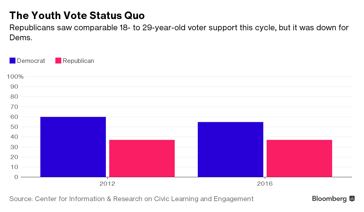
Among the younger portion of the millennial generation, 18 to 29 year olds, Trump earned 37 percent of the vote to Clinton's 55 percent. Millennials of color were considerably more likely to support Clinton than Trump, Circle found, while young white voters actually threw more support behind the winner. Trump secured 48 percent of the white vote in the 18-to-29 age group, while Clinton won just 43 percent. Still, Republicans fared poorly with youth vote overall. The election had the fourth-lowest turnout by young voters for a GOP nominee since 1972.
2. The emergence of young third-party voters
Your cheat sheet on life, in one weekly email.
Get our weekly Game Plan newsletter.
Sign UpAll but the very oldest millennials were too young to cast a ballot in 2000, when a third-party candidate last played an arguable role in the outcome. Eight percent of the 18-to-29 demographic voted for someone other than a major party nominee this year, compared with just 3 percent in 2012. "The percentage of youth supporting the Democratic candidate was lower than in both of President Obama’s elections, and closer to the level achieved by Bill Clinton in his successful 1996 campaign," wrote Circle.
Young millennials were slightly less eager to vote for the Democratic nominee than in 2012, when President Obama earned 60 percent of their votes to Mitt Romney's 37 percent. Millennials made up the same percentage of the electorate—19 percent—in 2016 as in 2012.
3. Not enough millennials voting to swing states
Battleground states felt the impact of Democratic-leaning millennials, but it wasn't enough to swing the outcome to Clinton. In Florida, for instance, Clinton earned 57 percent of the 18-to-29 year old vote compared with 35 percent for Trump. In North Carolina, Clinton took 60 percent of this vote compared to Trump's 36 percent. Had only millennials voted, Clinton would've won the election in a landslide, with 473electoral votes to Trump's 32.
The history books won't count millennials among the coalition that put president-elect Donald Trump into office, as most younger voters came out for Hillary Clinton. But in a departure from past voting patterns, young millennials were also keen on third-party candidates this year—nearly one in 10 voted for Jill Stein or Gary Johnson or wrote in their own candidate. Here are three ways to parse the numbers, based on an analysis of exit polls by the Center for Information & Research on Civic Learning & Engagement.
1. Democrats took the millennial vote—just not among whites.
Among the younger portion of the millennial generation, 18 to 29 year olds, Trump earned 37 percent of the vote to Clinton's 55 percent. Millennials of color were considerably more likely to support Clinton than Trump, Circle found, while young white voters actually threw more support behind the winner. Trump secured 48 percent of the white vote in the 18-to-29 age group, while Clinton won just 43 percent. Still, Republicans fared poorly with youth vote overall. The election had the fourth-lowest turnout by young voters for a GOP nominee since 1972.
2. The emergence of young third-party voters
Your cheat sheet on life, in one weekly email.
Get our weekly Game Plan newsletter.
Sign UpAll but the very oldest millennials were too young to cast a ballot in 2000, when a third-party candidate last played an arguable role in the outcome. Eight percent of the 18-to-29 demographic voted for someone other than a major party nominee this year, compared with just 3 percent in 2012. "The percentage of youth supporting the Democratic candidate was lower than in both of President Obama’s elections, and closer to the level achieved by Bill Clinton in his successful 1996 campaign," wrote Circle.
Young millennials were slightly less eager to vote for the Democratic nominee than in 2012, when President Obama earned 60 percent of their votes to Mitt Romney's 37 percent. Millennials made up the same percentage of the electorate—19 percent—in 2016 as in 2012.

3. Not enough millennials voting to swing states
Battleground states felt the impact of Democratic-leaning millennials, but it wasn't enough to swing the outcome to Clinton. In Florida, for instance, Clinton earned 57 percent of the 18-to-29 year old vote compared with 35 percent for Trump. In North Carolina, Clinton took 60 percent of this vote compared to Trump's 36 percent. Had only millennials voted, Clinton would've won the election in a landslide, with 473electoral votes to Trump's 32.
יום שישי, 23 בדצמבר 2016
#youthvote: useful lessons from political branding fot teen Marketing #marcapolitica
#marcapolitica
Rubén Weinsteiner

The recent election was full of useful lessons for marketers. I’m not talking about boring stuff like social media blah, blah, blah or advanced targeting blah, blah, blah. No, I’m talking about some big meta lessons: that truth and lies are the same, bombast is a great substitute for substance, civility is hokum, accepted standards are overrated. Couple these facts with regulatory agencies that will soon be headed by outsiders hostile to their very existence and 2017 is shaping up to be a banner year for teen marketers. The question is, will you have the guts to make it happen?
I’ll bet you do! In that case, here are a few pointers on how to make 2017 huge for your brands:
Tell Lies This is so easy to do! All you need to do is say whatever pops into your heads. Marketing a soft drink? Tell people it will make them more attractive. Don’t pussyfoot around, though, be explicit! “The best scientists in the world, they say, these scientists — the best — that Glam-o-Pop will definitely get you laid much more often [see “Be Offensive” below]. Drink it.” See? Simple!
Teens, in particular, will welcome unfounded claims that validate what they wish to be true!
Ignore Facts Let me start by quoting Sir Francis Drake as he defended General Custer after Pearl Harbor: “Facts are stubborn things.” Ha! What a joke. Sure, Sir Francis may have been good at defending red-headed pastry chefs but he clearly knew nothing about facts! They are meaningless! If someone wants to talk about facts, tell them to talk to the hand. Half the time people’s “facts” are nothing more that opinions supported by questionable science. Garbage.
Your teenage customers are already filling their busy little heads with so many useless facts from school; do them a favor and spare them the brain space!
Be Offensive I say offensive in jest. Offensive is in the eye of the offended and if you’re the one doing the so-called “offending,” you probably don’t feel offended at all! No, tell it like it is and let the chips fall where they may. There’s no reason not to use common — even earthy — language when describing people, places or situations. We’ve all gotten so circumspect that a change for the worse will still be a refreshing change.
Kids these days, they’ve been led down the primrose path of PC parlance. Enough already!
Make Threats A lot of marketers fall into the trap of trying to persuade customers to try or purchase products. Sure, that’s one approach; but what about the flip side of the coin? Threats and intimidation! Why haven’t more people glommed onto this concept? Using our Glam-o-Pop example from above, think how effective this campaign could be: “Drink Glam-o-Pop or we will kill your family. Seriously.”
Separating the wheat from the chaff is critical; those teens who are easily intimidated may be your very best customers!
Look Backward The future is a scary and uncertain place. You just never know what’s going to happen next. The past, on the other hand, is full of safe, familiar and easy answers, especially when viewed through wonderfully rose-colored glasses! Rather than taxing your creative resources for something new, why not just dust off an old campaign that you know works. Why shouldn’t Joe the Camel make a comeback — and why shouldn’t we be advertising cigarettes to kids anyway?
Nostalgia is a proven winner. Nostalgia. Teens eat it up. It wins. Every time.
Ignore “Experts” What I am giving you is good advice. You can trust me. But be careful. There are going to be plenty of people that will want to give you bad advice. Ignore them. They will tell you the ideas I have shared make no sense. The people who tell you things like that are idiots. There are a lot of them around. They will try to sound smart. Ignore them. They are idiots.
Know who else likes to ignore advice? Teens. Learn something from your audience!
Rubén Weinsteiner
#youthvote
marcapolitica
Rubén Weinsteiner
The recent election was full of useful lessons for marketers. I’m not talking about boring stuff like social media blah, blah, blah or advanced targeting blah, blah, blah. No, I’m talking about some big meta lessons: that truth and lies are the same, bombast is a great substitute for substance, civility is hokum, accepted standards are overrated. Couple these facts with regulatory agencies that will soon be headed by outsiders hostile to their very existence and 2017 is shaping up to be a banner year for teen marketers. The question is, will you have the guts to make it happen?
I’ll bet you do! In that case, here are a few pointers on how to make 2017 huge for your brands:
Tell Lies This is so easy to do! All you need to do is say whatever pops into your heads. Marketing a soft drink? Tell people it will make them more attractive. Don’t pussyfoot around, though, be explicit! “The best scientists in the world, they say, these scientists — the best — that Glam-o-Pop will definitely get you laid much more often [see “Be Offensive” below]. Drink it.” See? Simple!
Teens, in particular, will welcome unfounded claims that validate what they wish to be true!
Ignore Facts Let me start by quoting Sir Francis Drake as he defended General Custer after Pearl Harbor: “Facts are stubborn things.” Ha! What a joke. Sure, Sir Francis may have been good at defending red-headed pastry chefs but he clearly knew nothing about facts! They are meaningless! If someone wants to talk about facts, tell them to talk to the hand. Half the time people’s “facts” are nothing more that opinions supported by questionable science. Garbage.
Your teenage customers are already filling their busy little heads with so many useless facts from school; do them a favor and spare them the brain space!
Be Offensive I say offensive in jest. Offensive is in the eye of the offended and if you’re the one doing the so-called “offending,” you probably don’t feel offended at all! No, tell it like it is and let the chips fall where they may. There’s no reason not to use common — even earthy — language when describing people, places or situations. We’ve all gotten so circumspect that a change for the worse will still be a refreshing change.
Kids these days, they’ve been led down the primrose path of PC parlance. Enough already!
Make Threats A lot of marketers fall into the trap of trying to persuade customers to try or purchase products. Sure, that’s one approach; but what about the flip side of the coin? Threats and intimidation! Why haven’t more people glommed onto this concept? Using our Glam-o-Pop example from above, think how effective this campaign could be: “Drink Glam-o-Pop or we will kill your family. Seriously.”
Separating the wheat from the chaff is critical; those teens who are easily intimidated may be your very best customers!
Look Backward The future is a scary and uncertain place. You just never know what’s going to happen next. The past, on the other hand, is full of safe, familiar and easy answers, especially when viewed through wonderfully rose-colored glasses! Rather than taxing your creative resources for something new, why not just dust off an old campaign that you know works. Why shouldn’t Joe the Camel make a comeback — and why shouldn’t we be advertising cigarettes to kids anyway?
Nostalgia is a proven winner. Nostalgia. Teens eat it up. It wins. Every time.
Ignore “Experts” What I am giving you is good advice. You can trust me. But be careful. There are going to be plenty of people that will want to give you bad advice. Ignore them. They will tell you the ideas I have shared make no sense. The people who tell you things like that are idiots. There are a lot of them around. They will try to sound smart. Ignore them. They are idiots.
Know who else likes to ignore advice? Teens. Learn something from your audience!
Rubén Weinsteiner
#youthvote
marcapolitica
תוויות:
marcapolitica,
marcas,
political,
ruben,
rubén,
votojoven,
weinsteiner,
youthvote
הירשם ל-
רשומות (Atom)
