
It has never been harder to design a good visual identity. Brands live on dozens of platforms, so they have to look as good on a billboard as they do on a phone screen. Armchair critics emboldened by the ease of the web attack change no matter how necessary, skewing clients toward less ambitious work. And yet the companies below managed to eke out thoughtful, even occasionally daring, new visual identities this year. Of course not everyone hit the mark. Here, we take you through a year of branding—the good, the bad, and the most controversial.
The Best
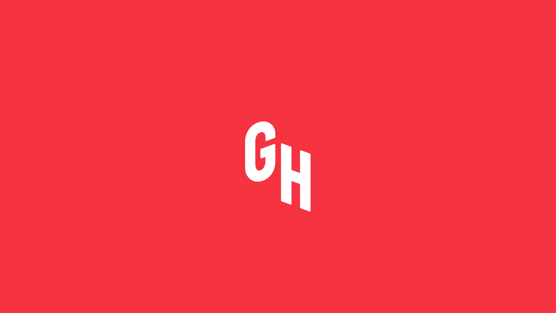
Grubhub
Grubhub may have started out as a small startup, but in 2016, the 12-year-old company services 7 million people and 44,000 restaurants. It needed a grown-up redesign: a look that was authentic yet polished and one that would work on both a national and hyper-local level. Wolff Olins took on the task and rebranded the company, populating ads with lifestyle photos (think Airbnb ads and Apple commercials) and hand-drawn lettering, and adding chef highlights, animated food items, and a custom keyboard of GrubHub "mmmojis" to the site. Overall, the new look is fresh and professional, but retained some of the scrappy personality of its earlier paper cut-out illustrations. The hope is that it will persuade the shrinking, but still sizable population of people who still prefer placing delivery orders over the phone to switch to the web.
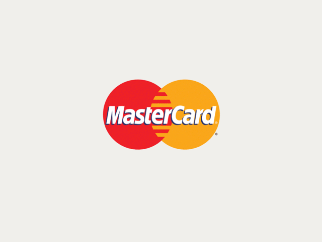
MasterCard
Before this year the MasterCard logo hadn't changed significantly in 20 years, but the way that we buy and pay for things certainly had. Tasked with the company's first major redesign in two decades, Pentagram partner Michael Bierut and designer Hamish Smyth refrained from making drastic changes to the familiar overlapping yellow and red circles in the logo—instead opting to modernize it by removing the comb effect in the center and placing the wordmark outside of the symbol. With the option to just use the familiar symbol without the wordmark, the system is flexible enough to work across multiple products and platforms, like the MasterPass digital payments and Priceless rewards program. The logo is also optimized to work well on mobile, the direction most of our bank transactions have been going.
Helia
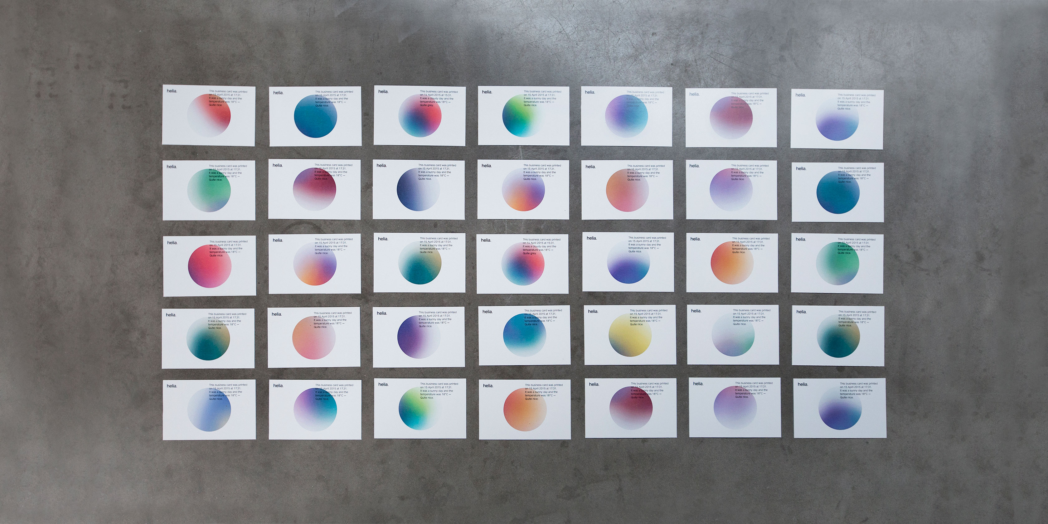
Sometimes it's the lesser-known companies that pack the biggest punch with a stellar redesign. Such was the case with Helia, a data science and analytics company whose client roster includes companies like Unilever, easyJet, IBM, Diageo, and Sony PlayStation. Designed by the New York-based design firm Form&, the identity system centers around a simple circular logo imbued with a gradient that changes colors based on weather and geographic data. In that way, in both the print and digital form, the color of the logo serves as a unique data stamp. The eye-catching redesign brings a company that typically works behind-the-scenes front and center.
In May, Instagram shocked the internet when it unveiled a pared-down, rainbow-gradient upgrade to its Polaroid icon. But the new icon contained some clever details: an image that referenced photography's evolution away from film-based cameras to phones, and a rainbow gradient that made the icon pop in a sea of other icons (and subtly referenced the rainbow stripes of the old icon). Not surprisingly, the fervor quickly subsided. Now your thumb gravitates instinctively toward the icon on your phone dashboard without a passing thought given to the skeuomorphic old one (there's no need to reference analog cameras in an app for your iPhone cam).

Zendesk
The customer service software provider Zendesk offers one of the most drastic before-and-after logo stories: from a cartoonish smiling Buddha on a chat headset to a sleek system of geometric shapes. The identity retained its playfulness, though, with each Zendesk service receiving an iteration of the logo that has its own animated personality. The Help Center, for example, is two arrows, one leading the other. The logo for Support is a tall rectangle leaning on a shorter one. The best part might be when you realize why this charming shape system is so familiar: It was inspired by wooden toy blocks from the founder's Danish childhood.
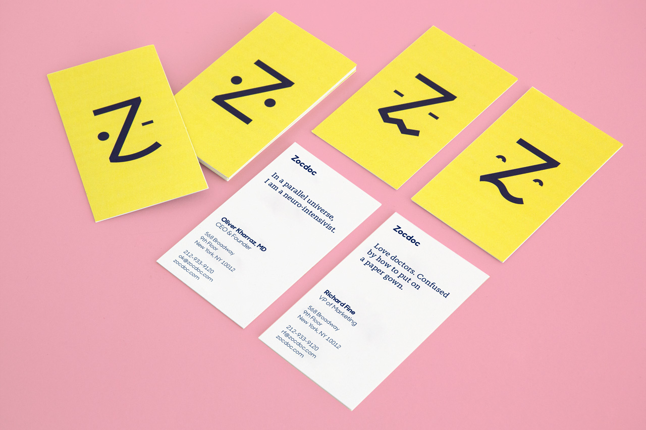
Zocdoc
Health care platform Zocdoc launched in 2007 with a staid, traditional logo that the company's founders bought for a mere $80. Now that the business is valued at $1.8 billion and is rapidly expanding its model to connect patients with hospital systems as well as individual practitioners, it figured it could afford something new. Wolff Olins did the redesign: a friendly, human-centered identity with a cute little anthropomorphic logo that turns the letter Z into a emoticon-like face, who goes by "Zee." The responsive Zee gets it: He can look puzzled, sad, relieved, happy. He too experiences the roller-coaster ride of emotions you go through when you're sick and struggling to recall the details of your health care co-pay, all while trying to book an appointment today, not three weeks from now.
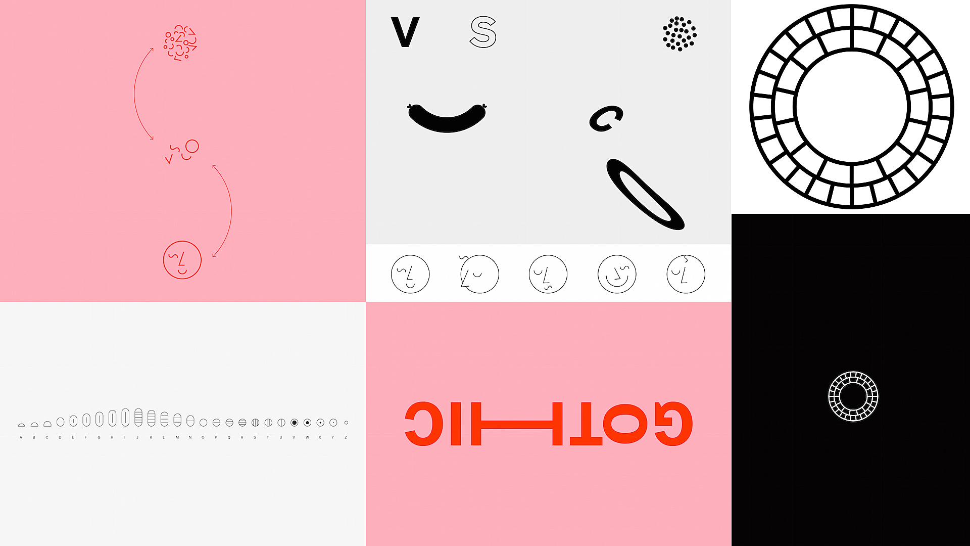
VSCO
VSCO, the popular image editing app, got a major redesign this year, of both its user interface (launched in June) and its visual identity (launched in February). The identity redesign was based around a custom-made VSCO Gothic typeface and a system of slick yet emotive symbols that construct a visual alphabet of sorts. The new circular logo is meant to embody the global community that now uses the app not just for editing, but also as a photo-sharing platform. VSCO is like an artier Instagram, with a user base of mostly professional and amateur photographers. The new black, white, and dusty pink design reflects its trendiness, but in a way that is crisp and polished.
The Most Controversial
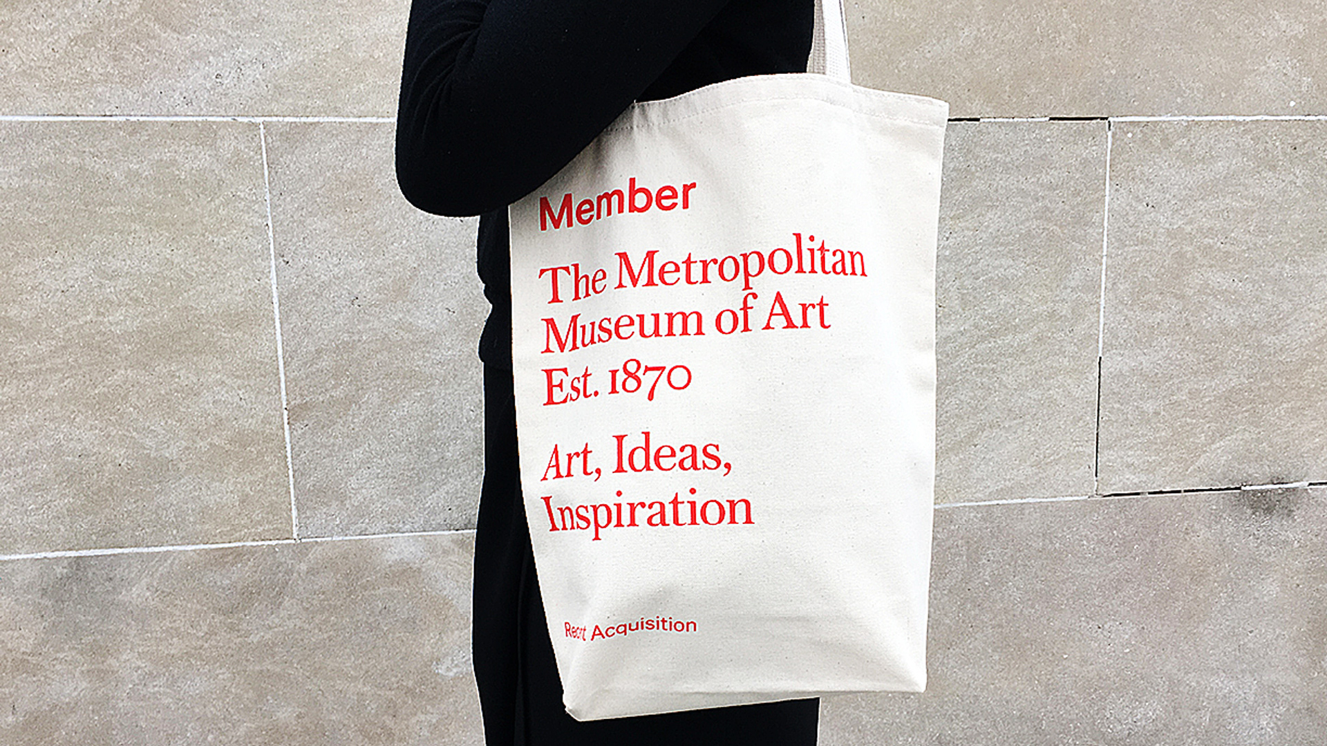
The Met
This year, the award for the rebrand that drew the most outrage goes to the Metropolitan Museum of Art. The Met overhauled its logo and identity system—much to the chagrin of many design critics—and revealed a new logo that rebrands the museum as "The Met." The two words, stacked on top of each other in large scarlet lettering, replaced the stylized M logo originally taken from a woodcut by Luca Pacioli. Wolff Olins did the identity, but the rollout was botched when the museum sent out press materials with the new logo before it was announced. Identities tend to get judged harshly when they are launched sans explanation—especially changes as major as this one—but it's been 10 months and the logo has already worn in nicely. We like the bold new design, and we're glad it stuck around long enough for the dust to settle.
The Worst
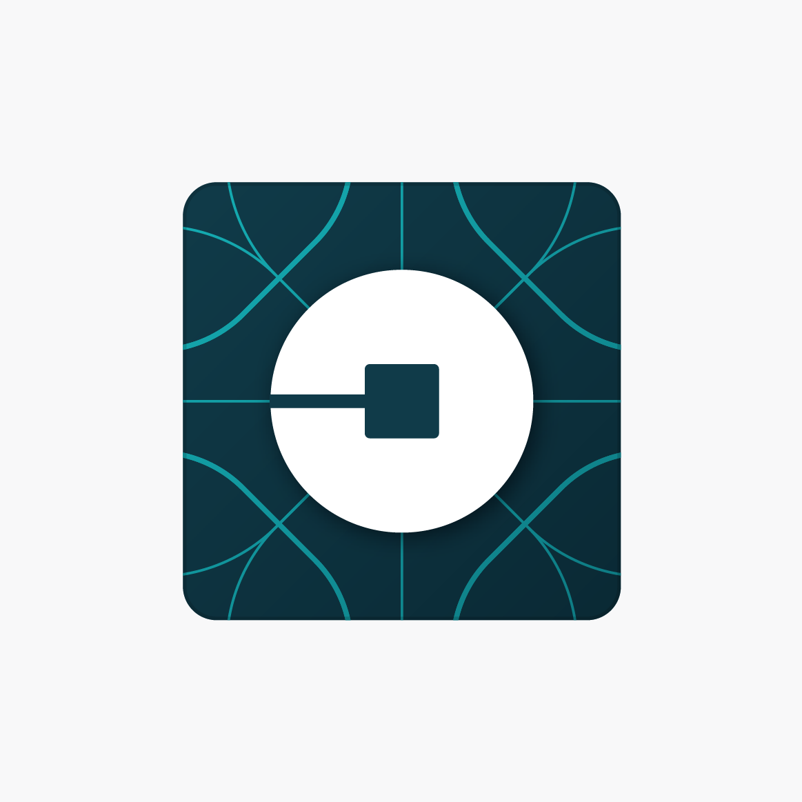
Uber
When Uber's new icon came out in February, it was widely ridiculed. It looked like PacMan. An asshole. A "little kind of bluish sideways ass." Wired dedicated considerably more words to the icon with a behind-the-scenes look, during which Uber CEO Travis Kalanick said he kept the design in-house because he didn't trust anyone else to do it for him. Bad call, Kalanick. The icon managed to look both soullessly corporate and overworked. It was also poorly executed. Yet, just like the (better, more thoughtful) Instagram redesign, the Uber icon shows how quickly these controversial rebrandings are normalized—particularly with apps we interact with so much that their use becomes almost subconscious.
Trump-Pence Logo
Well, here we are: the absolute worst brand design of the year. We wish we didn't have to bring this pair up, but there's no getting around the fact that the Trump-Pence logo takes the prize. The animation above says it all, but Twitter said it pretty well, too. The campaign buckled under the online mockery, pulled the logo, and replaced it with something less suggestive, but it was too late. The image is seared into our minds forever. With Trumpistan looming, you'll want to keep this GIF close—a memento from simpler times.
Related Video: How To Build A Strong Brand Without Constantly Thinking About Branding
אין תגובות:
הוסף רשומת תגובה